Saturday, September 20, 2014
Finally a moment to blogg again.
Just one more day of Wright architecture, I promise. But it was a big day...

On this day we went right back to the beginning of Mr Wright's career to see his "Prarie Style" architecture from the beginning of the 20th century in the leafy Chicago suburb of Oak Park.
First stop, 875 Lake Street, Oak Park, Unity Temple. Designed 1905, completed 1908. Wright was living in Oak Park and his father had been a Universalist preacher.
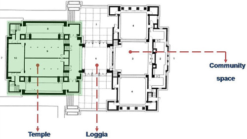
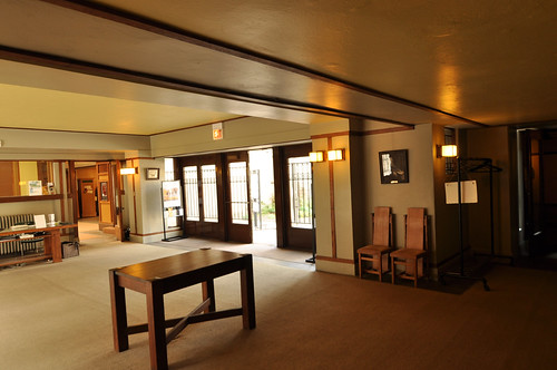
The floor plan basically consists of 3 rooms. The "green room" on the left is the temple itself then to the right, the entry Loggia or a room with open sides. And to the right of that is the community space for social gatherings.
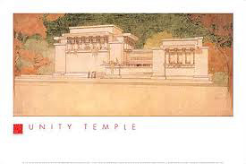
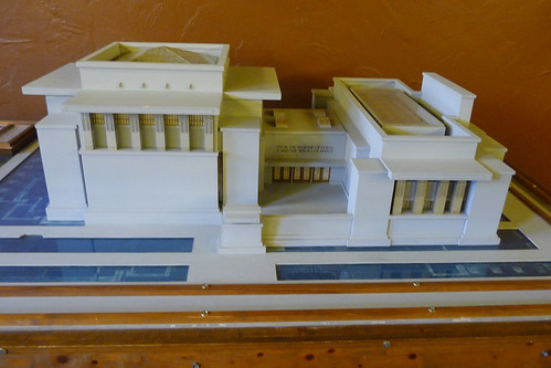
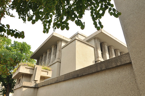
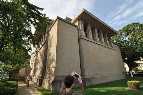
Located on a busy main street in Oak Park, Unity Temple sits as a heavy mass on the site.
And this is the building itself. The cast-in-place reinforced concrete Unity Temple is considered by many architects to be one of the first modern buildings in the world.
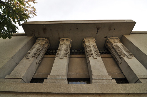
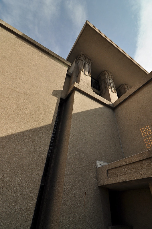
Because of the noise level from the street, the temple appears to be windowless save for a few clerestory windows placed in recessed parts of the façade.
"Bring out the nature of the materials"
In his essay "In the Cause of Architecture" Wright said about building materials, "let their nature intimately into your scheme. Reveal the nature of wood, plaster, brick, or stone in your designs, they are all by nature friendly and beautiful. No treatment can be really a matter of fine art when those natural characteristics are, or their nature is, outraged or neglected." Therefore, he left the concrete natural and exposed.
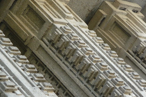
While Wright’s innovative use of concrete was chosen for its economy, the completed building ultimately cost nearly twice the contracted price due to complications encountered during construction.
This intricate detailing is reminiscent of Hollyhock House in Los Angeles that Wright would design in 1919.
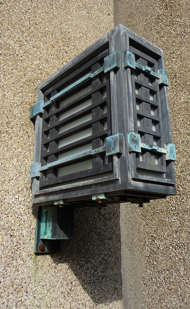
Fabulous exterior wall sconce.
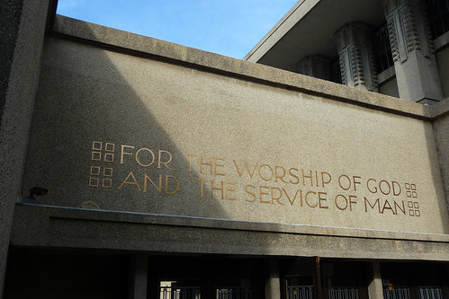
Entry to the building is via a low hall that connects Unity Temple and Unity House. Above the bank of doors leading into the hall, an inscription in bronze declares, "For the worship of God and the service of man."
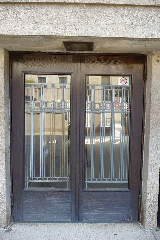
The main entry doors into the central loggia.
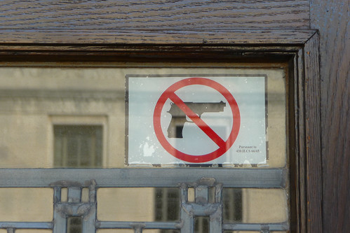
You know your in America when...
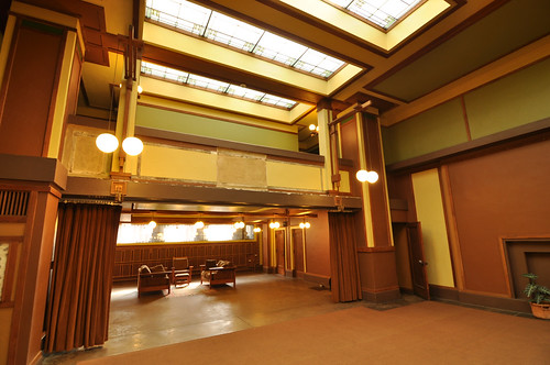
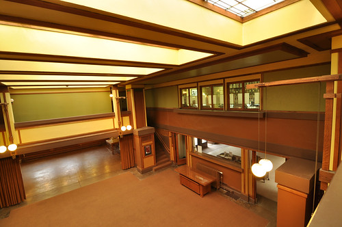
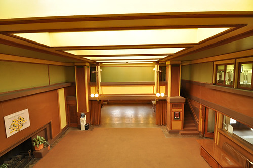
To create a sense of drama Wright famously used a technique he dubbed "Compression and Release". He did this by contrasting the entry space such as the relatively small dimly lit loggia with its low ceiling in contrast with the adjoining expanse of the community space. This confining space, termed the "embrace" or "compress," made the visitor uncomfortable and encouraged them to move from the entrance into the larger main room, hence the "release."
The community space.
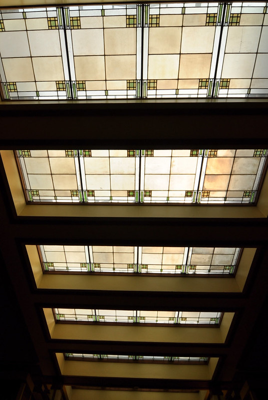
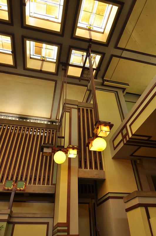
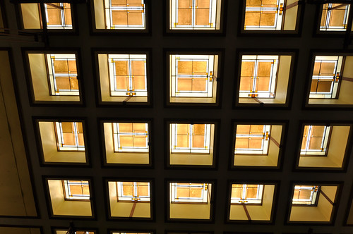
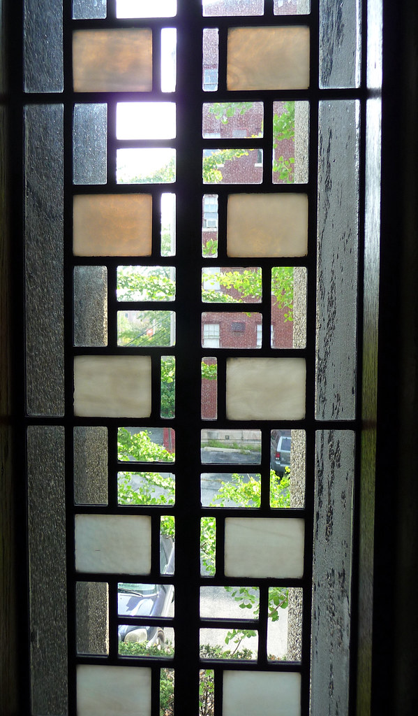
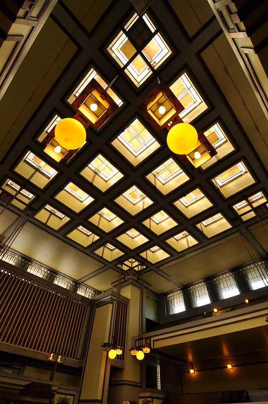
Stained glass roof windows designed with green, yellow, and brown tones in order to evoke the colors of nature.
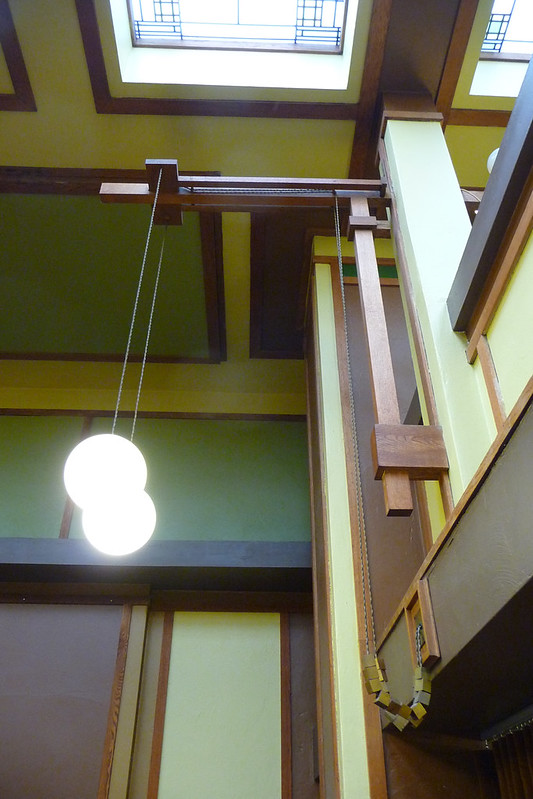
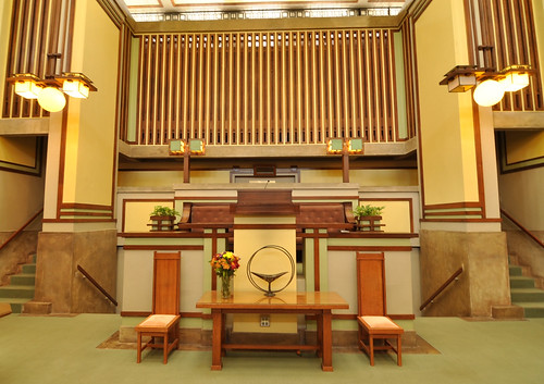
Every detail was designed by Wright himself. The lighting fixtures, the tracery on the wall, and the stained glass windows.
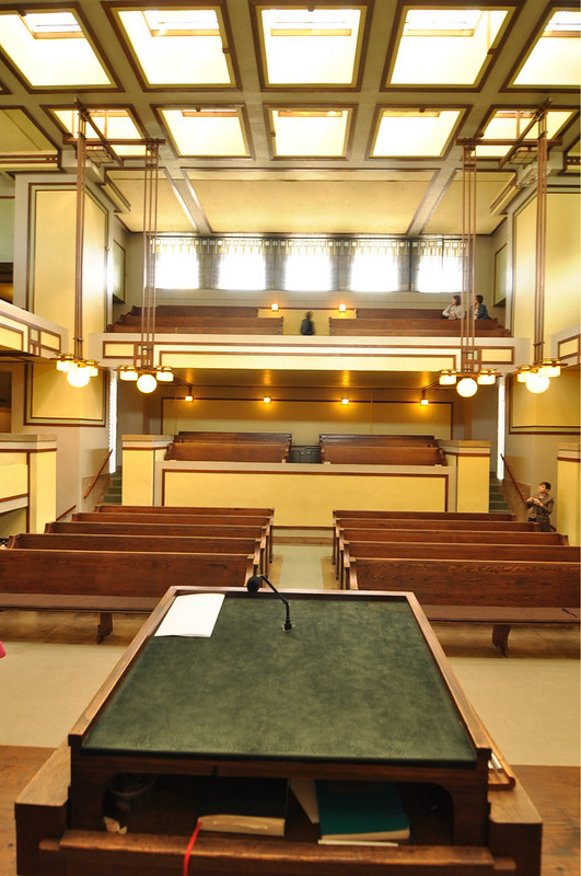
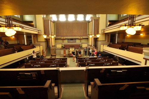
And the large brightly lit Temple itself as seen from the pulpit.
Roof light.
One of very few slot windows in the walls.
The pulpit.
All of the seating within the temple is placed within 12 metres of the pulpit.
Whereas I loved the First Unitarian Meeting House that we visited in Madison a few days earlier, Alexandra preferred this space. It was an impressive space...
From here we walked a few leafy blocks to the home and studio that Wright called home.
Lloydnalex


Thank you for a truly inspiring blog.
ReplyDelete